Google ChartsにTimelineというチャートがあります。御覧のように横軸に時間を置き、個々のアイテムの時間的長さを表示するものです。
今回はTimelineのノーマルな描画の仕方のあと、ツールチップのカスタマイズや、Spreadsheetからのデータ読み込みとグラフ描画に取り組んでみたいと思います。
Timelineのデータフォーマット
公式サイトにありますが、Timelineのデータフォーマットは以下の通りで、これに従ってデータテーブルを作成していくことになります。
| Column 0 | Column 1 | Column 2 | Column 3 | Column 4 | |
| Purpose: | Row label | Bar label | Tooltip | Start | End |
| Data Type: | string | string | string | number or date | number or date |
| Role: | data | data | tooltip | data | data |
Column 1 と Column 2 は optional なので、必要ない場合は省略できます。
Column 1 はバーに直接書くラベル、Column 2 はツールチップをカスタマイズする場合に使用する任意の文字列です。
Timelineの基本的なコード
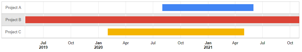
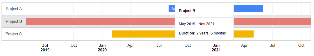
上記のフォーマットに従い、次に表示するようなタイムラインを描画することを考えます。
この場合のサンプルコードは、以下となります。
<html>
<head>
<script type="text/javascript" src="https://www.gstatic.com/charts/loader.js"></script>
<script type="text/javascript">
 google.charts.load('current', {'packages':['timeline']});
      google.charts.setOnLoadCallback(drawChart);
      function drawChart() {
        var container = document.getElementById('timeline');
        var chart = new google.visualization.Timeline(container);
        var dataTable = new google.visualization.DataTable();

        dataTable.addColumn({ type: 'string', id: 'Name' });
        dataTable.addColumn({ type: 'string', id: 'dummy Label' });
        dataTable.addColumn({ type: 'date', id: 'Start' });
        dataTable.addColumn({ type: 'date', id: 'End' });
        dataTable.addRows([
          [ 'Project A', 'AAA', new Date(2020, 7), new Date(2021, 5) ],
          [ 'Project B', null, new Date(2019, 4),  new Date(2021, 10) ],
          [ 'Project C', null, new Date(2020, 1),  new Date(2021, 4) ]]);

        chart.draw(dataTable, null);
      }
</script>
</head>
<body>
       <div id="timeline" style="height: 180px; width: 1000px;"></div>
</body>
</html>
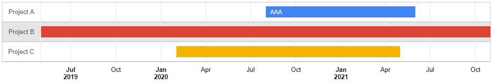
データフォーマットに従って、”Row Label”, “Bar Label”, “Start”, “End” にパラメータを格納します。
        dataTable.addColumn({ type: 'string', id: 'Name' });
        dataTable.addColumn({ type: 'string', id: 'dummy Label' });
        dataTable.addColumn({ type: 'date', id: 'Start' });
        dataTable.addColumn({ type: 'date', id: 'End' });
        dataTable.addRows([
          [ 'Project A', 'AAA', new Date(2020, 7), new Date(2021, 5) ],
          [ 'Project B', null, new Date(2019, 4),  new Date(2021, 10) ],
          [ 'Project C', null, new Date(2020, 1),  new Date(2021, 4) ]]);
ここではツールチップはカスタマイズしないので、”Column 2″は使用していません。
この場合、ツールチップの表示はデフォルトのものとなります。
ツールチップのカスタマイズ
では、こちらのツールチップをカスタマイズしてみましょう。
先に記載したように、ツールチップに任意の文書や文言を入れたい場合は、optional である Column 2を使用します。
<html>
<head>
<script type="text/javascript" src="https://www.gstatic.com/charts/loader.js"></script>
<script type="text/javascript">
 google.charts.load('current', {'packages':['timeline']});
      google.charts.setOnLoadCallback(drawChart);
      function drawChart() {
        var container = document.getElementById('timeline');
        var chart = new google.visualization.Timeline(container);
        var dataTable = new google.visualization.DataTable();

        dataTable.addColumn({ type: 'string', id: 'Name' });
        dataTable.addColumn({ type: 'string', id: 'dummy Label' });
        dataTable.addColumn({ type: 'string', role: 'tooltip'});
        dataTable.addColumn({ type: 'date', id: 'Start' });
        dataTable.addColumn({ type: 'date', id: 'End' });
        dataTable.addRows([
          [ 'Project A', 'AAA', ' This is a <b>sample tool tip</b> contents. </br> 改行もされています。', new Date(2020, 7), new Date(2021, 5) ],
          [ 'Project B', null, '', new Date(2019, 4),  new Date(2021, 10) ],
          [ 'Project C', null, '', new Date(2020, 1),  new Date(2021, 4) ]]);

        var options = {
          tooltip: {isHtml: true}
        };

        chart.draw(dataTable, options);
      }
</script>
</head>
<body>
       <div id="timeline" style="height: 180px; width: 1000px;"></div>
</body>
</html>
データセットに Column 2 を定義し、
dataTable.addColumn({ type: 'string', role: 'tooltip'});データを追加するときに、ツールチップに表示したい値を追加しています。
[ 'Project A', 'AAA', ' This is a <b>sample tool tip</b> contents. </br> 改行もされています。', new Date(2020, 7), new Date(2021, 5) ],
コードにあるようにツールチップにはhtmlタグを埋め込むことも可能です。その場合は、オプションパラメータとして isHtml: true を使用します。
var options = {
tooltip: {isHtml: true}
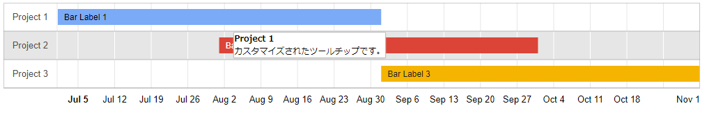
};このような対応をすると、次のようなタイムラインが得られます。
マウスオーバーで、カスタマイズされたツールチップが表示されているのがわかります。
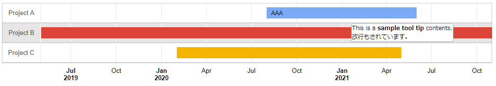
但しこの場合、デフォルトのツールチップは表示されなくなります。
この場合、2番目、3番目のバーにはツールチップをブランクとしていますので、マウスオーバーしても何も表示されません。
spreadsheetからの読み込み
最後に、スプレッドシートから読み込みをしてみましょう。
基本的にはデータをそのままスプレッドシートに記載しておきます。
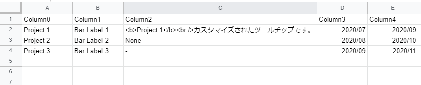
こちらを読み込むことで、タイムシートを表示させることもできます。
サンプルコードは以下。
<html>
<head>
<script type="text/javascript" src="https://www.gstatic.com/charts/loader.js"></script>
<script type="text/javascript">
      google.charts.load('48', {'packages':['timeline']});
      google.charts.setOnLoadCallback(drawChart);

      function drawChart() {
         // スプレッドシートへのアクセス
         var query = new google.visualization.Query('https://docs.google.com/spreadsheets/d/xxxxxxxxxxxxxxxxxxxxxxxxxxx/edit#gid=0&headers=1');
         // コールバック関数のセット
         query.send(handleDataQueryResponse);
      }

      function handleDataQueryResponse(response) {
          var dataTable = response.getDataTable();
          dataTable.setColumnProperty(2, "role", "tooltip");
          if (response.isError()) {
              alert('Error in query: ' + response.getMessage() + ' ' + response.getDetailedMessage());
              return;
          }

          var options = {
            tooltip: {isHtml: true}
          };

          var chart = new google.visualization.Timeline(document.getElementById('timeline'));

          chart.draw(dataTable, options);
      }
</script>
</head>
<body>
       <div id="timeline" style="height: 180px; width: 1000px;"></div>
</body>
</html>
一つポイントを挙げるなら、次の部分です。
setColumnProperty メソッドを利用して、Index 2のカラムのプロパティに role = “tooltip” であることを設定します。
dataTable.setColumnProperty(2, "role", "tooltip");Index 2 のカラムは特殊で、ここの部分の設定がないと、次のようにカラム数が不適切であるというエラーメッセージが発生します。
Invalid data table format: must have 3 or 4 data columns.

setColumnProperty で role を明記しておくと、spreadsheetにデータを記載しておくことで、次のようにツールチップもカスタマイズしたタイムラインが描画できるというわけです。